The Buffalo Sabres have been a fixture in the NHL since 1970, and throughout their 55-year history, the franchise has become as much known for their uniform evolution as for the legendary players who wore them. From the iconic royal blue and gold of their debut season to the controversial “Buffaslug” era and back to their beloved roots, the Sabres’ jersey journey tells a story of identity, experimentation, and ultimately, a return to what made them special in the first place. This comprehensive look at the Buffalo Sabres jersey history from 1970 to present chronicles every major change, logo redesign, and color scheme evolution that has defined the franchise’s visual identity over more than five decades.
The original royal blue era: Buffalo Sabres jersey history 1970 to present begins
When the Buffalo Sabres took the ice for their inaugural 1970-71 season, they introduced a uniform that would become synonymous with the franchise for decades. The original jersey featured a dominant royal blue color scheme with gold trim adorning the shoulders, sleeves, and waist stripes. The away jerseys presented a clean white canvas, accented with blue and gold details that created a cohesive and professional look.
The centerpiece of these jerseys was the now-iconic logo: a charging buffalo (technically a bison for the zoologically accurate) positioned between a crossed pair of sabres. This symbol perfectly captured the spirit of Buffalo and the aggressive nature the expansion team wanted to project. The three-stripe design on the sleeves and waist became a signature element, with yellow stripes on the dark jerseys and yellow-and-blue combinations on the white versions.
These uniforms placed the Sabres among the era’s most aesthetically pleasing teams, fitting seamlessly alongside other 1970s NHL classics. For an expansion franchise, having such a strong visual identity from day one proved invaluable, especially as the team found early success in the mid-1970s with stars like Gilbert Perreault and the famed French Connection line. The simplicity and elegance of the original design would prove timeless, setting a standard the franchise would struggle to match in later decades.
The original look remained largely unchanged through the 1977 season, creating a consistent brand identity during the franchise’s formative years. This stability allowed fans to form deep emotional connections with the jersey, associations that would last for generations and eventually drive calls for its return decades later.
Early modifications to the Buffalo Sabres jersey history 1970 to present
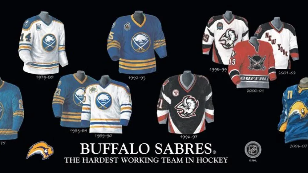
The first significant modifications to the Sabres’ uniform came during the late 1970s, as detailed by NHL Uniforms. In 1977-78, thanks to an NHL mandate, the team added player names to the backs of both home and away jerseys. This change improved fan experience and helped viewers identify players more easily, though it slightly altered the clean aesthetic of the original design.
The 1978-79 season brought more noticeable changes when the Sabres added their primary logo to both shoulders, positioned just above the player numbers. While this created some redundancy with the chest logo, it added symmetry to the overall design. The team also replaced the traditional lace-up neckpiece with a V-neck collar, a modernization that moved away from hockey’s traditional aesthetic but provided a sleeker appearance.
By the early 1980s, additional tweaks continued to accumulate. In 1980, the sock striping pattern changed to two sets of three stripes, creating more visual complexity. The 1982-83 season introduced a slimmer font for both nameplates and numbers, giving the jerseys a more refined, less bulky appearance. While purists might have preferred the original typeface, the change was subtle enough not to dramatically alter the jersey’s character.
The mid-1980s brought perhaps the most noticeable pre-1996 changes when the Sabres thickened the striping on their sweaters, socks, and pants. They also added additional stripes throughout the uniform, reflecting the era’s tendency toward busier, more complex designs. Despite these modifications, the core identity of the royal blue and gold remained intact, and the charging buffalo logo continued to serve as the franchise’s primary symbol through the 1995-96 season.
The dramatic shift in Buffalo Sabres jersey history 1970 to present: the goat head era
The 1996-97 season marked a watershed moment in the Buffalo Sabres jersey history from 1970 to present, as the franchise completely overhauled its look when moving from the beloved Buffalo Memorial Auditorium to the newly constructed Marine Midland Arena (now KeyBank Center). For reasons that remain debated to this day, the Sabres abandoned their classic royal blue and gold color scheme in favor of a bold new palette of black, red, silver, and white.
The centerpiece of this redesign was an entirely new logo: an angry buffalo head rendered in aggressive, modern styling that fans quickly nicknamed the “goat head.” This logo represented a dramatic departure from the crossed-sabres design, projecting a fiercer, more contemporary image. The jerseys themselves were predominantly black, with red, white, and silver striping creating a look that embodied 1990s sports aesthetics.
For the first time in franchise history, the Sabres introduced secondary shoulder logos different from the primary chest crest. These featured a stylized “B” with a sword piercing through it, a design that has since gained popularity on merchandise and apparel. The font changed to a blocky, slightly-italicized typeface that reinforced the modern feel. Logos also appeared on pants and helmets for the first time, with the script “Buffalo Sabres” adorning the pants.
Initial fan reaction was decidedly mixed, with many longtime supporters mourning the loss of the traditional look. However, as The Hockey Writers notes, these jerseys have undergone a complete rehabilitation in public opinion. The goat head era coincided with some of the franchise’s most successful years, including the 1999 Stanley Cup Final run, and nostalgia has transformed these once-controversial uniforms into beloved throwbacks. The design has proven so popular that elements have been incorporated into recent alternate jerseys and reverse retro editions.
Alternate experiments in Buffalo Sabres jersey history 1970 to present
In 2000, the Sabres expanded their uniform lineup by introducing a red alternate jersey that built upon the black goat head design. This predominantly red sweater featured black, silver, and white striping and introduced yet another logo variation: crossed cartoon swords over a black circular background, often called the “dinner plate” logo by fans. The word “BUFFALO” appeared across the waist in all capital letters, a bold design choice that emphasized the team’s geographic identity.
This alternate jersey represented the franchise’s willingness to experiment with multiple looks simultaneously, though it didn’t last long in the team’s rotation. The red jersey has become something of a collector’s item, as its relatively brief appearance makes it a rarer sight at games today. The dinner plate logo, while not universally beloved, represents an interesting footnote in the franchise’s design evolution.
Throughout the early 2000s, the black and red color scheme continued to dominate the Sabres’ visual identity. Players like Miroslav Satan, Chris Drury, and Daniel Briere became synonymous with these uniforms, and the team’s on-ice success helped fans warm to the departure from tradition. The goat head era ultimately lasted a full decade, longer than many expected when it was first unveiled.
Despite growing appreciation for the goat head jerseys over time, a segment of the fanbase never stopped advocating for a return to royal blue and gold. This undercurrent of nostalgia would eventually influence the franchise’s decision-making in the years ahead, though not before several more controversial designs made their appearance.
The Buffaslug: a low point in Buffalo Sabres jersey history 1970 to present
The 2006-07 season introduced what many consider the most controversial design in Buffalo Sabres jersey history from 1970 to present: the infamous “Buffaslug.” This radical redesign attempted to modernize the franchise’s look while incorporating nods to the team’s heritage, but the execution fell dramatically short of those goals. The result was a logo and uniform set that immediately sparked fan backlash and has since become a cautionary tale in sports design.
The Buffaslug logo featured a stylized, sleek buffalo in motion, rendered in a way that made it appear to be missing legs—hence the unflattering nickname. The color scheme shifted to navy blue, silver, and gold, an attempt to bridge the gap between the original royal blue era and something more contemporary. The jerseys themselves featured navy blue as the primary color with silver and yellow striping that many felt clashed rather than complemented each other.
One innovation the Buffaslug era introduced was the placement of player numbers on the upper right chest—a design element never before seen in the NHL. While some teams would briefly experiment with front numbers following the Sabres’ lead, the trend never truly caught on league-wide. The font for numbers and nameplates also changed to reflect mid-2000s sports design trends, and silver appeared prominently throughout, including on the nameplates themselves.
To mollify unhappy fans, the organization did offer a reprieve by introducing a third jersey that was essentially a throwback to the original royal blue uniform, complete with the classic crossed-sabres logo. This alternate proved far more popular than the primary uniforms, though inexplicably, the team used it for only one season before shelving it in favor of other options. Ironically, the Buffaslug era coincided with the last period of genuine Stanley Cup contention for the franchise, with the 2006-07 season seeing the Sabres as Presidents’ Trophy contenders before playoff disappointment struck.
Transitioning through navy blue in Buffalo Sabres jersey history 1970 to present
In 2008-09, the Sabres took their first step toward correcting the Buffaslug mistake by introducing a new alternate jersey that brought back the classic crossed-sabres logo. While this was welcomed news for fans who had despised the slug, the jersey retained the navy blue and silver color scheme rather than returning to the beloved royal blue. The design mimicked elements of the original uniforms but with modern styling and, unfortunately, that persistent silver that continued to polarize fans.
When these alternates became the team’s full-time uniforms, the Buffaslug was officially retired, joining the franchise’s scrap heap of failed experiments. However, the silver remained prominent, appearing in large panels under the arms and as piping on sleeve and waist stripes. This silver detailing, often referred to as “pit stains” by critics, became an unwelcome signature of the uniforms throughout this era. The Sabres also maintained the front chest numbers, making them the last NHL team to feature this design element.
The 2010-11 season saw the introduction of another interesting alternate that attempted to pay homage to the original color scheme while adding unique touches. This royal blue and yellow jersey featured prominent stitching throughout and four yellow stripes on each sleeve and at the waist. The numbers had a quilted appearance that gave them texture and depth, and the overall construction suggested a vintage, throwback aesthetic.
The chest logo on this alternate proved controversial, featuring a small version of the primary crossed-sabres logo positioned off-center beneath a larger script logo reading “BUFFALO SABRES.” This script was meant to honor the American Hockey League’s Buffalo Bisons, but the execution felt cluttered to some observers. Despite mixed opinions on the logo placement, many fans appreciated the return to royal blue, even if only as an alternate option. These jerseys hinted at what would eventually become the franchise’s direction nearly a decade later.
The turd burger and its place in Buffalo Sabres jersey history 1970 to present
In 2013, the Sabres unveiled what might be the single most ridiculed jersey in franchise history—a design so poorly received that then-team president Ted Black himself referred to it as a “turd burger” during its unveiling. This spectacular misfire featured gold as the dominant color on the front of the jersey with navy blue taking over on the back and sleeves, creating a jarring two-tone effect unlike anything else in the NHL.
The front of the jersey was predominantly yellow with silver numbers and the word “BUFFALO” positioned above the primary logo at chest level. The back featured navy blue with the player’s name and number in silver. This split-personality design philosophy created a uniform that looked like two different jerseys awkwardly grafted together. The silver sleeves and silver number font did nothing to improve the aesthetic, and the overall effect was universally panned.
The manner of the jersey’s reveal only added to the embarrassment. The Sabres’ marketing team attempted to build suspense through a week-long Twitter campaign with teaser images, culminating in photos of then-captain Steve Ott standing in a T-pose while wearing the jersey. The anticlimactic and awkward reveal perfectly matched the quality of the design itself. Fans and media members immediately began mocking the uniform, and the “turd burger” nickname stuck permanently.
Mercifully, this jersey had a short lifespan in the Sabres’ rotation, lasting only two seasons before being quietly retired. It stands as perhaps the clearest example of design-by-committee gone wrong, attempting to please multiple constituencies while ultimately satisfying no one. The turd burger era serves as a reminder that even professional sports franchises with significant resources can completely whiff on uniform design when they lose sight of what made their identity special in the first place.
The Adidas era and 50th anniversary in Buffalo Sabres jersey history 1970 to present
When the NHL switched from Reebok to Adidas as its official uniform manufacturer in 2017, the Sabres received their ADIZERO redesign while still maintaining the navy blue color scheme. The new jerseys finally eliminated most of the unpopular silver “pit stains” under the arms and reduced silver piping throughout the uniform. The full commitment to navy blue and gold actually created a reasonably attractive uniform, though it still couldn’t satisfy fans who wanted a return to royal blue.
One positive change was the removal of excessive number placements. Previous designs had featured numbers on the back, sleeves, and upper right chest, creating a cluttered appearance. The Adidas redesign simplified this, though the front numbers remained until 2020. The three-stripe design still made the jersey feel somewhat busy, but overall the aesthetic was cleaner and more cohesive than what had come before.
Ahead of the 2019-20 season, the Sabres celebrated their 50th anniversary with a special “Golden Season” jersey that generated significant positive buzz. This predominantly white sweater featured gold and navy stripes on the sleeves, socks, and waist, with the five stripes representing the franchise’s five decades. Inside the collar were images of each primary logo used since 1970, a thoughtful detail that honored the team’s complete history.
The 50th anniversary jersey incorporated the traditional crossed-sabres crest in gold and navy, with special textured stitching that added depth to the logo and numbers. The helmet and pants featured a golden charging buffalo logo, and the overall package represented one of the franchise’s most successful special edition designs. Unfortunately, the COVID-19 pandemic cut the 2019-20 season short, limiting the number of times fans could see these beautiful uniforms in action. Crucially, the Sabres also announced during this season that they would be returning to royal blue full-time in 2020-21, setting the stage for the franchise’s most significant uniform change in decades.
The return to royal and current Buffalo Sabres jersey history 1970 to present
After years of fan advocacy and multiple failed design experiments, the Buffalo Sabres finally delivered what their supporters had been requesting since 1996: a full-time return to royal blue and gold. The 2020-21 season marked the beginning of a new era with uniforms that closely resembled the original 1970-71 designs, with only minor modifications to account for modern manufacturing and style preferences.
The new jerseys brought back the iconic royal blue as the primary color with gold trim on the shoulders, sleeves, and waist. The classic crossed-sabres logo returned to its rightful place as the primary chest crest, and the traditional three-stripe pattern adorned both home and away uniforms. The only notable difference from the originals was the addition of shoulder yokes, which many fans felt actually enhanced rather than detracted from the classic look.
The response from the Sabres’ fanbase was overwhelmingly positive. After decades of navy blue, black, silver, and questionable design choices, the franchise had finally come full circle. The front chest numbers were eliminated, the Buffaslug was a distant memory, and the turd burger was forgotten. The return to royal blue represented more than just a uniform change—it symbolized the franchise’s reconnection with its heritage and acknowledgment of what its fans truly valued.
In 2022, the Sabres added another layer to their current uniform lineup by bringing back the goat head logo as an alternate jersey, but this time rendered in the royal blue and gold color scheme rather than the original black and red. This move brilliantly satisfied both camps of Sabres fans: those who loved the original color scheme and those who had nostalgia for the 1990s goat head era. The alternate has proven extremely popular, with fans regularly sporting goat head merchandise at KeyBank Center.
The evolution of the Buffalo Sabres jersey history from 1970 to present ultimately tells a story of a franchise that experimented boldly, sometimes succeeded, often failed, but eventually found its way back to its roots. The current royal blue and gold uniforms honor the past while looking crisp and modern on today’s ice. After 55 years of jersey changes—some beloved, some tolerated, and some best forgotten—the Sabres have landed on a visual identity that connects the franchise’s rich history with its future aspirations. For a team still searching for its first Stanley Cup championship, at least the organization got one thing definitively right: they’re once again wearing uniforms worthy of the passionate fans who have supported them through every high and low since that first game in 1970.
Par Mike Jonderson
Mike Jonderson is a passionate hockey analyst and expert in advanced NHL statistics. A former college player and mathematics graduate, he combines his understanding of the game with technical expertise to develop innovative predictive models and contribute to the evolution of modern hockey analytics.