The NHL unveiled its boldest outdoor game designs yet for the 2026 Stadium Series, merging Tampa Bay’s swashbuckling heritage with Boston’s New England pride in a visually striking matchup. When the Boston Bruins and Tampa Bay Lightning face off at Raymond James Stadium on February 1, 2026, they’ll wear jerseys that tell stories far beyond traditional team logos. The Lightning’s design fully embraces pirate imagery tied to the city’s famous Gasparilla festival, while the Bruins counter with a sunshine-themed look that brings New England unity to Florida’s warmth. These aren’t just uniforms—they’re wearable narratives crafted through months of collaboration between the teams, the league, and Fanatics, designed to capture the unique energy of playing hockey outdoors in the Sunshine State.
The designs represent a significant departure from the nostalgic aesthetic of the Winter Classic, instead embracing what NHL chief branding officer Brian Jennings calls a “more futuristic, progressive look.” This philosophy allows teams to experiment with unconventional elements, resulting in jerseys packed with hidden details, cultural references, and innovative materials that reward close inspection.
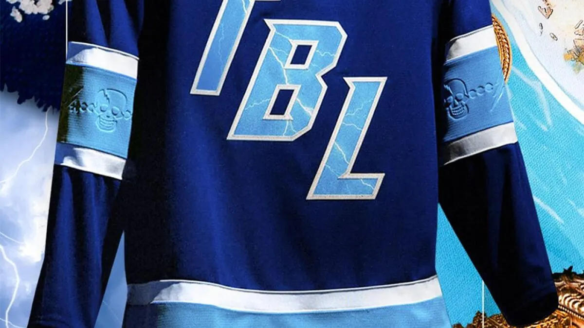
Tampa Bay Lightning embrace pirate heritage in Stadium Series design
The Lightning’s 2026 Stadium Series uniform weaves pirate lore throughout every seam, creating what senior creative director Dom Fillion describes as “a great nod to the culture of the city.” The design team tapped into Tampa Bay’s maritime heritage, specifically timing the game the day after the world-famous Gasparilla Pirate Fest to maximize the thematic connection. This isn’t superficial theming—nearly every element incorporates authentic pirate iconography reimagined through a hockey lens.
The partnership between the Lightning, NHL, and Fanatics produced a jersey that balances three critical themes: the uniqueness of outdoor hockey in Florida, Tampa Bay’s rich cultural heritage, and the franchise’s proud history. Kevin Preast, Chief Venue Officer for the Lightning, emphasized that the uniform “weaves together three key themes: the uniqueness of playing outdoors in Florida, the rich heritage and culture of Tampa Bay, and the proud history of our organization.” This multi-layered approach ensures the design resonates with both longtime season ticket holders and casual fans drawn to the spectacle.
Swashbuckling shoulder patches and hidden treasures
The most prominent pirate element appears on the shoulder—a newly commissioned patch featuring the Lightning name wrapped around a white skull with a lightning bolt on its forehead, crossed by two pirate sabers at the bottom. This Jolly Roger-inspired crest represents the first time Tampa Bay will wear skull imagery on an official game jersey, though variations have appeared on fan merchandise. The design blends Ziggy Stardust energy with classic pirate aesthetics, creating something both contemporary and rooted in maritime tradition.
Hidden details reward the observant fan. Inside the collar, blue and white beadwork references the plastic necklaces thrown during Gasparilla parades, connecting the jersey directly to Tampa’s living pirate tradition. These bead patterns also appear debossed within the light blue stripes around the waist and arms, creating texture that references pirate accessories without overwhelming the design. Perhaps most clever is the “Easter egg” tag on the back hem—a tattered Lightning flag that looks as though it has weathered storms aboard a pirate ship, tying directly to the game’s location at the Buccaneers’ stadium.
Sky blue innovation meets lightning imagery
The Lightning introduced an entirely new shade to their palette: sky blue, inspired by the Florida outdoor setting and the vibrant in-arena graphics at Benchmark International Arena. This color choice reflects “the energy at Benchmark International Arena on a typical Lightning gameday,” according to Fillion, and provides a bright, modern counterpoint to the traditional royal blue base. The sky blue appears in the thick stripe wrapping around the waist and sleeves, as well as in the “TBL” lettering on the front crest.
What sets this jersey apart technically is the photo-realistic lightning texture embedded within the letters and numbers. Unlike the cartoon lightning bolts from the team’s 1990s alternates or 2022 Reverse Retro jerseys, this design features intricate lightning veins painstakingly crafted by digital artists. Fillion’s team worked closely with factories to ensure each vein maintained proper width and placement, with colors tweaked to make the bolts pop against the sky blue background. “It’s all part of why people think we might be a little bit crazy within the design space, but being obsessed about the details ultimately makes a difference,” Fillion explained.
Connecting to Tampa Bay’s Gasparilla tradition
The timing of the Stadium Series game immediately following Gasparilla Pirate Fest wasn’t coincidental—it was central to the design vision. While Fanatics didn’t explicitly cite Gasparilla in their official descriptions, the references are unmistakable for locals. The beadwork throughout the jersey mirrors the Mardi Gras-style bead culture that defines the festival, while the skull imagery and crossed swords speak directly to the pirate ships that parade through Tampa Bay each year.
The Lightning also maintained continuity with their 2022 Stadium Series appearance in Nashville by using the same font for the crest and numbers. This “subtle continuity” acknowledges the franchise’s outdoor game history while allowing the pirate theming to take center stage. The result is a jersey that feels fresh yet familiar, innovative yet respectful of the team’s identity.
Boston Bruins bring New England pride to sunny Florida
While the Lightning dove deep into local pirate culture, the Bruins took a different approach—bringing New England’s identity to Florida through what they call “Sunshine Gold” and solar motifs. This marks Boston’s sixth outdoor game and their first Stadium Series appearance since 2016, giving the design team license to experiment with a more vibrant, Florida-inspired palette while maintaining the franchise’s signature edge.
Bruins vice president of marketing Andrea Mazzarelli approached the project with a cut-and-paste method in her office, literally arranging printer paper to visualize the design. “If ever we were going to go a little bit wild or a little bit dialled up, it would be for Stadium Series,” she said. The result is a jersey that honors Boston’s heritage while embracing the unique location.
Sunshine gold and solar motifs
The Bruins’ most dramatic departure is their bright yellow base—officially dubbed “Sunshine Gold”—which represents a significant brightening of their traditional gold. This warmer shade directly acknowledges the Florida setting and creates immediate visual separation from their usual home and away uniforms. The color choice signals that this is a special event jersey, not bound by traditional color conventions.
Solar imagery appears throughout via embossed sunburst patterns on the sleeves and hem-loop label. These subtle rays catch light differently depending on viewing angle, creating dynamic texture that mimics actual sunshine. The front crest features “Boston” prominently across the chest in bold black letters, with the team’s bear logo—normally a shoulder patch this season—positioned below. This arrangement intentionally nods to the New England Patriots’ wordmark style, playing off the football stadium setting and creating cross-sport synergy with the Buccaneers’ home venue.
Bear claws and New England unity
Team president Cam Neely insisted the design needed “a little bit more nastiness,” leading to the prominent bear claw motif. A new black “B” shoulder logo appears layered over white claw slashes, with this same mark repeated on helmets and pants. The five claw marks represent the bear’s ferocity, ensuring the Bruins’ identity remains intimidating despite the sunny color scheme.
The collar holds perhaps the most meaningful detail for Boston fans—the postal abbreviations of all six New England states (MA, CT, RI, VT, NH, ME). This tribute recognizes the snowbirds who travel south for winter and the diaspora of New Englanders who maintain their fandom from afar. “You can take the people out of New England, but you can’t take New England out of the people,” Mazzarelli said. The design element transforms a functional jersey component into a statement of regional pride, ensuring fans from Hartford to Portland feel represented on national television.
Honoring history while embracing innovation
The Bruins balanced innovation with respect for their century-long heritage. The “Boston” wordmark draws inspiration from early 1920s jerseys that featured both city name and nickname, while the bear logo maintains continuity with the team’s current season design. The claw marks add modern aggression, and the sun motifs acknowledge the game’s location—every element serves multiple narrative purposes.
Mazzarelli emphasized that “design with intention” guided every decision. “Don’t just logo slap or throw something on there. If it is going on the jersey, it is intentional.” This philosophy explains why even minor details like the hem-loop Easter egg—a sunset behind the Bruins logo—reinforce the Florida setting while maintaining brand identity.
Design philosophy behind the 2026 stadium series jerseys
The NHL Stadium Series has evolved into a laboratory for jersey design, distinct from the Winter Classic’s nostalgic pond hockey aesthetic. Jennings explains that while the Winter Classic “is a retro, nostalgic look, and a little bit of returning to the game being played on ponds, what we looked at with Stadium Series was a more futuristic, progressive look.” This positioning gives teams creative freedom to push boundaries and tell localized stories.
The 2026 Florida games represent the culmination of hockey’s explosive growth in the state. Jennings noted that when the league announced two outdoor games in Florida, “people were like, ‘Wow, the league is really pushing it, and maybe they’ve lost their minds.’ We’ve been kind of smiling behind the scenes and saying it really is a tribute to the growth of hockey.” The designs reflect this confidence, unapologetically celebrating their environment rather than apologizing for it.
Collaborative process between Fanatics and teams
Both jerseys emerged from intensive collaboration starting in early March, just weeks after the January announcement. The Lightning, Bruins, NHL, and Fanatics participated in multiple design calls, with final approval coming in April. Dom Fillion emphasized that these special events allow brands to “stretch and extend the brand…try new stuff and offer a different point of view for the fan.” This collaborative spirit ensures team identities remain intact while exploring creative frontiers.
For the Lightning, Kevin Preast and his team provided deep insights into Tampa Bay’s cultural touchstones, particularly Gasparilla. For the Bruins, Mazzarelli and creative services director Mark Majewski shepherded the vision, with Neely providing critical feedback about maintaining the team’s edge. The NHL facilitated the process, ensuring designs met league standards while honoring each team’s brand narrative.
Balancing tradition with futuristic vision
The Lightning’s jersey exemplifies this balance—introducing sky blue and photo-realistic lightning while maintaining font continuity with their 2022 Stadium Series appearance. The pirate theming feels fresh because it’s rooted in authentic local culture, not generic nautical clichés. Similarly, the Bruins’ Sunshine Gold and solar motifs represent a bold departure, but the bear imagery and New England collar detail anchor the design in franchise DNA.
The technical execution pushes boundaries too. Both jerseys feature multiple debossed patterns, custom-mixed colors, and innovative materials designed for outdoor viewing. The Lightning’s lightning veins and the Bruins’ sun-ray textures required extensive factory testing to ensure durability and visual impact. As Fillion noted, “being obsessed about the details ultimately makes a difference,” whether that means perfecting bead placement or ensuring claw marks look authentically fierce.
Fans can purchase both jerseys beginning December 15 at 10 a.m. ET through the Fanatics network, NHLShop.com, and team stores. The Lightning will host a special preview for Bolt For Life members at Tampa Bay Sports inside Benchmark International Arena from 8 a.m. to noon, with public sales opening thereafter. Boston will offer merchandise through BostonProShop.com and their Hub on Causeway location.
The February 1 showdown concludes a historic month for Florida hockey, following the January 2 Winter Classic between the Florida Panthers and New York Rangers at loanDepot park. For the Lightning and Bruins, these jerseys represent more than special-event merchandise—they’re artifacts of a moment when hockey fully embraced its Sun Belt expansion, proving the game belongs everywhere, even under palm trees and pirate flags. When the opening faceoff drops at Raymond James Stadium, the designs will have already accomplished their mission: telling stories that connect teams, cities, and fans in ways traditional uniforms never could.
Frequently Asked Questions
Par Mike Jonderson
Mike Jonderson is a passionate hockey analyst and expert in advanced NHL statistics. A former college player and mathematics graduate, he combines his understanding of the game with technical expertise to develop innovative predictive models and contribute to the evolution of modern hockey analytics.