









The history of NHL uniforms and team colors is a fascinating journey through more than a century of hockey tradition, innovation, and sometimes questionable fashion choices. From the earliest days when players simply wore wool sweaters borrowed from their everyday wardrobes to today’s high-tech, moisture-wicking jerseys engineered for peak performance, the evolution of hockey uniforms tells the story of the sport itself. These jerseys have become more than just functional garments—they’re symbols of team identity, regional pride, and hockey heritage that connect generations of fans to their favorite franchises.
What began as practical necessity has transformed into a multimillion-dollar industry where every design choice carries weight. The colors teams wear on the ice have become inseparable from their identities, with certain combinations instantly recognizable around the world. Understanding how we arrived at today’s sophisticated uniform designs requires looking back at the innovations, experiments, and occasional disasters that shaped the visual landscape of professional hockey.
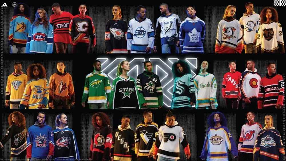
The early days of hockey sweaters and the history of NHL uniforms and team colors
In hockey’s infancy, the concept of a specialized uniform didn’t exist. Players in the early 1900s wore actual sweaters—the same heavy wool garments you’d find in any clothing store. Teams would purchase several sweaters in matching patterns, add numbers to the back, and occasionally place a simple logo on the front. This utilitarian approach reflected the sport’s working-class roots and the limited resources available to early hockey organizations.
The term “sweater” remains embedded in hockey vocabulary today precisely because of these origins. Early jerseys featured patterns like barber-pole stripes or chest bands in contrasting colors, serving the dual purpose of distinguishing teams while providing warmth in frigid arenas. With television decades away from invention, there was little concern about how teams appeared to distant audiences. If spectators in the arena could tell a red jersey from a blue one, that was sufficient.
Players often borrowed equipment from other sports, particularly football pants which they’d use during hockey games before storing them away for the summer. This cross-sport borrowing extended to entire uniform concepts, with turtleneck sweaters paired with knee-high socks creating the iconic early hockey look. The emphasis was purely functional—keeping players warm and providing basic team identification.
As hockey leagues began organizing and teams from different cities started competing regularly, the need for more distinctive uniforms became apparent. The 1920 Stanley Cup Final highlighted this issue when Seattle’s PCuHL champions arrived wearing uniforms remarkably similar to Ottawa’s. The solution was simple: Ottawa switched to white jerseys for the series, establishing an early precedent for contrasting colors that would eventually become league policy.
By the late 1930s, uniform design began shifting toward solid colors with more intricate crests. Teams moved away from the striped patterns of earlier eras, embracing cleaner designs that would define the classic hockey look. Pants transitioned from neutral canvas colors to team-specific hues, creating more cohesive uniform sets that strengthened team identity.
Original Six era and traditional team colors in NHL uniform history
The Original Six era, spanning from 1942 to 1967, established the traditional color palette that many still associate with classic hockey. During this quarter-century period, NHL jerseys existed in a remarkably limited spectrum: red, blue, black, gold, and white. This conservative approach created timeless designs that remain largely unchanged for several franchises today, demonstrating the enduring appeal of these classic combinations.
The Montreal Canadiens epitomize this era’s aesthetic evolution. When they joined the league in 1910, their first jerseys were solid blue with a white crescent ‘C’ on the front. The following year they adopted red, white, and blue, though not in the familiar configuration fans know today. These early Montreal jerseys featured barber-pole striped lines similar to Ottawa’s, with the blue letters ‘CAC’ (Club Athletique Canadien) on a white maple leaf—making Montreal, ironically, the first NHA/NHL team to wear a maple leaf on their sweaters.
After winning the Stanley Cup in 1924, the Canadiens made a bold statement by replacing their ‘CH’ logo with an earth globe on their chest, signifying their status as World Champions. This proved temporary, and by the 1925-26 season, the distinctive ‘CH’ logo and uniform design that remains iconic today was finalized. This evolution from experimentation to a settled identity mirrored the league’s own maturation during this period.
The Detroit Red Wings faced uniform complications in 1933 when they discovered their new colors matched Montreal’s exactly. When the teams first met in Montreal, the Wings were forced to wear white covers over their jerseys—similar to modern gym class pinnies. These covers obscured player numbers, frustrating fans and sparking debate about color coordination across the league. This incident accelerated discussions about standardizing which teams wore which colors during games.
The Toronto Maple Leafs, New York Rangers, Boston Bruins, and Chicago Blackhawks all established their signature looks during this era, creating visual identities so strong they’ve required only minor adjustments over subsequent decades. The Original Six’s commitment to traditional colors created a foundation that expansion teams would both honor and challenge.
The expansion era and the explosion of colors in NHL uniforms
When the NHL expanded from six to twelve teams in 1967, the league’s color palette exploded. Suddenly, every color in the rainbow found representation on NHL jerseys, forever changing the visual landscape of professional hockey. The Los Angeles Kings introduced purple (officially named Forum blue) to the league, the Philadelphia Flyers reintroduced orange, and both the California (later Oakland) Seals and Minnesota North Stars took to the ice wearing green.
These expansion teams viewed their uniforms as opportunities to establish distinct identities in markets unfamiliar with hockey. The color choices reflected regional preferences and ownership personalities, with varying degrees of success. Some combinations, like the Kings’ purple and gold, captured imaginations and created lasting legacies. Others would prove more controversial and short-lived.
The California Golden Seals under owner Charlie O. Finley represented the era’s most audacious uniform experiment. Finley, who also owned baseball’s Oakland Athletics, outfitted his hockey team in the same kelly green and gold color scheme. More notoriously, he insisted his players wear white skates, giving them the appearance of figure skaters rather than hockey warriors. Players complained that the white skates retained more water than traditional black skates, making them extremely heavy by the third period and actually slowing players down. The white skates disappeared after one season when Finley sold the team in 1974, and the Seals shifted to teal.
The Washington Capitals made their own questionable fashion statement in 1975 when they decided players should wear white pants with red jerseys. The experiment proved disastrous, becoming the subject of massive ridicule. The white pants, combined with the team’s historically terrible inaugural season (just eight wins), created a visual identity the franchise was eager to shed. The white pants quickly went to pasture, remembered only as a cautionary tale in uniform design.
Not all expansion-era innovations met with derision. The 1970s also saw the reintroduction of names on jersey backs. Though the New York Americans experimented with names in 1926 to thumbs-down reception, the New York Rangers successfully reintroduced them in the NHL during the 1970s. Initially, home teams could wear names at their discretion and road teams needed home team permission. Starting in 1977-78, names became mandatory on all jerseys, initially placed straight across before the Red Wings introduced vertically-arched names in 1982.
The infamous uniform disasters of the 1970s and 1980s
Perhaps no uniform in the history of NHL uniforms and team colors generated more bewilderment than the Vancouver Canucks’ redesign in the late 1970s. For a fee of $100,000, the team hired San Francisco marketing firm Beyl, Boyd and Turner to overhaul their conservative look. What emerged was one of the biggest eyesores in professional sports history—uniforms covered in huge “V’s” supposedly representing “victory” (though cynics noted they could just as easily stand for “Vancouver”). The design’s garishness became a running joke throughout the league. When Pat Quinn took over as general manager, disposing of these uniforms ranked among his first priorities.
The early 1980s brought Cooperalls (officially CCM Pro Pak long shells) to the NHL, representing an attempt to revolutionize hockey pants themselves. The Philadelphia Flyers pioneered this change, followed by the Hartford Whalers, replacing traditional short pants with long pants resembling those used in amateur hockey. Players quickly discovered a critical flaw: the long pants caused them to slide faster and uncontrollably on the ice whenever they fell, creating dangerous situations when careening toward the boards. The NHL banned Cooperalls following the 1982-83 season, and both teams returned to traditional short pants. The experiment proved that not all innovations represented progress, according to The Hockey Writers.
The New York Islanders contributed their own uniform controversy in the mid-1990s when they departed from their traditional design for something radical. The new look featured a logo with a figure bearing striking resemblance to the Gorton’s fisherman mascot. Rangers fans taunted Islanders supporters with chants of “We want fishsticks,” adding insult to injury for a franchise struggling on the ice. The embarrassing design lasted just two seasons before the logo was retired, with the entire uniform design scrapped after three seasons. The Islanders quickly returned to their classic look, having learned that drastic departures from established identity rarely succeed.
Toronto owner Harold Ballard created his own uniform controversy in 1977-78 when the NHL mandated player names appear on jerseys alongside numbers. Ballard refused, claiming the requirement would hurt program sales. The league threatened heavy fines, forcing Ballard’s compliance. For Toronto’s February 26, 1978 game in Chicago, names appeared on the Leafs’ blue jerseys—but in blue lettering, rendering them unreadable. The league immediately amended the rule to specify names must appear in colors contrasting with the jersey. Ballard’s petty defiance only delayed the inevitable while embarrassing his franchise.
On St. Patrick’s Day 1934, King Clancy participated in a ceremony unlike any other when he was honored with a special night in Toronto. After receiving numerous gifts while seated on a throne atop a large float, Clancy played against the New York Rangers wearing a green uniform with a large shamrock on the back—the only time in NHL history a single player wore a jersey completely different from every other player on the ice. Rangers coach Lester Patrick found the green sweater confusing and asked Clancy to change back to his regular uniform after the first period, ending this unique moment in hockey fashion history.
The modern era of NHL uniform design and technology
The NHL commissioned Reebok in the mid-2000s to develop a revolutionary uniform system. After two years of research and development, the Reebok Edge uniform system debuted at the 2007 All-Star Game, promising lighter, more breathable jerseys engineered for optimal athletic performance. All 30 teams adopted Edge uniforms the following season, with some maintaining their traditional designs while others used the transition to unveil new looks.
However, early Edge jerseys faced unexpected problems. A couple months into the 2007-08 season, players reported the new jerseys were trapping moisture rather than wicking it away as promised. Reebok responded by changing materials and issuing revised jerseys to all teams, demonstrating that even cutting-edge technology requires real-world testing and adjustment. The Edge system would ultimately prove successful, lasting ten seasons until the next evolution arrived.
Adidas, Reebok’s parent company, took over NHL jersey manufacturing and introduced the Adizero uniform system beginning in the 2017-18 season. Adidas maintained the basic Edge silhouette while introducing construction improvements including a lighter shoulder yoke and lay-flat collar design. The manufacturer changeover also standardized tail stripes to follow the curved hemline’s contour, creating visual consistency across all teams. These modern uniforms represent the pinnacle of hockey apparel engineering, balancing tradition with innovation.
The 1990s brought renewed creativity to the history of NHL uniforms and team colors through the third jersey program. The San Jose Sharks reintroduced teal to the NHL’s palette in 1991, earning immediate praise for their distinctive look. The NHL later adopted teal for Eastern Conference All-Star Game uniforms in the mid-90s, validating the Sharks’ design success. In 1993, the Mighty Ducks of Anaheim debuted with official colors of jade and eggplant, pushing hockey’s color boundaries further.
Some third jersey designs raised eyebrows, as noted by NHL Uniforms. The Mighty Ducks wore a jersey featuring a huge duck crashing through ice while wearing goalie equipment, while the Kings wore white jerseys with a logo on the upper left chest resembling Burger King’s mascot. These experimental designs demonstrated teams’ willingness to take creative risks with alternate uniforms, though not all succeeded commercially or aesthetically. Several wild third jersey designs eventually graduated to become regular uniforms, showing how alternate jerseys serve as testing grounds for bold concepts.
The significance of home and away colors throughout NHL uniform history
The home-and-away color designation has switched multiple times throughout NHL history, reflecting changing priorities from in-arena visibility to television considerations. In 1950, the NHL mandated contrasting uniforms, with home teams wearing dark jerseys and visitors wearing white. This decision stemmed from the increasing number of motion picture newsreels being filmed at games, which would soon transition to black and white television broadcasts. The league recognized that contrasting colors made it easier for viewers to distinguish teams during monochrome broadcasts.
Hockey Night In Canada suggested a reversal in 1970, with the NHL switching to home teams wearing white jerseys. The rationale was showcasing visiting teams’ more interesting colored away jerseys during color broadcasts, which were becoming standard. This arrangement lasted until 2003, when the league switched back to home teams wearing dark jerseys and visitors wearing white. The changes demonstrate how broadcasting technology and marketing considerations continually influence even fundamental aspects of uniform design.
The debate about jersey colors intersects with larger questions about team identity and tradition. Certain color combinations have become so synonymous with specific franchises that altering them would seem unthinkable. The Montreal Canadiens’ red, white, and blue; the Toronto Maple Leafs’ blue and white; the Detroit Red Wings’ red and white—these combinations transcend mere aesthetics to represent decades of history and countless memorable moments.
Contemporary NHL teams carefully guard their visual identities while seeking opportunities for creative expression through alternate jerseys. The league’s current approach allows franchises to maintain classic looks for standard games while experimenting with heritage uniforms, special event jerseys, and creative alternates that appeal to different segments of their fanbase. This balance between tradition and innovation defines the current era of NHL uniform design.
The evolution from simple wool sweaters to today’s engineered performance garments mirrors hockey’s transformation from a regional pastime to a global entertainment property. Yet certain fundamental elements remain unchanged—the basic jersey shape, the emphasis on team colors, and the critical role uniforms play in establishing franchise identity. These constants anchor the sport’s visual heritage even as technology and fashion continue advancing.
The history of NHL uniforms and team colors reflects more than changing fashion trends or technological advancement—it chronicles the sport’s cultural evolution and the enduring power of visual identity. From the Original Six’s traditional palette to expansion teams’ rainbow of new colors, from embarrassing missteps like white skates and fisherman logos to innovative successes like the Edge system, every uniform decision adds another chapter to hockey’s rich visual narrative. Today’s jerseys carry the weight of this history while incorporating cutting-edge materials that would astound the wool-sweater-wearing pioneers who first laced up their skates. As the NHL continues growing and evolving, one certainty remains: the colors teams wear on the ice will continue serving as powerful symbols connecting fans to the sport they love, honoring tradition while embracing the future.

Par Mike Jonderson
Mike Jonderson is a passionate hockey analyst and expert in advanced NHL statistics. A former college player and mathematics graduate, he combines his understanding of the game with technical expertise to develop innovative predictive models and contribute to the evolution of modern hockey analytics.