The Edmonton Oilers partnered with legendary comic book artist Todd McFarlane to design their third jersey in 2001, creating a bold, navy, silver, and white uniform featuring a gear-and-oil-drop logo. The jersey became one of hockey’s most polarizing designs, inspiring debate among fans who view it as a masterpiece or as a misfire. McFarlane, famous for Spawn, led the project as part of the Edmonton Investors Group, and his design helped the Oilers set sales records for third jerseys while challenging the team’s traditional branding approach. The jersey’s visual impact and its cultural significance mark a unique moment when hockey culture met pop art sensibility.
The creative vision behind the Todd McFarlane Edmonton Oilers third jersey
The NHL’s expansion of third jerseys at the turn of the millennium opened opportunities for teams to experiment. For the 2001-02 season, the Oilers initially sought design help externally, but McFarlane, at the peak of his pop culture influence, convinced ownership to let him lead. He rejected obvious logos and drew inspiration from Original Six teams, aiming for a design that would read well from two feet away, 100 feet away, and on television, while avoiding a look that felt “too crazy.” The design was described by the Edmonton Journal as having “hip-hop sensibility” with “a generous nod to skateboard chic” and “rap-star appeal with Gen X allure.” The navy jersey with silver and white accents featured a lace-up collar, and the target demographic was the 18-30 age group.
The jersey debuted on October 26, 2001, and was worn again the next night in a 3-2 victory over the Vancouver Canucks on Hockey Night in Canada. Reactions were strongly polarized, with fans offering broad opinions. Patrick Laforge, then CEO and president of the Oilers, indicated the gamble paid off commercially as the jersey broke NHL records for third jersey sales in both units and dollars.
The intricate symbolism of the primary and secondary marks
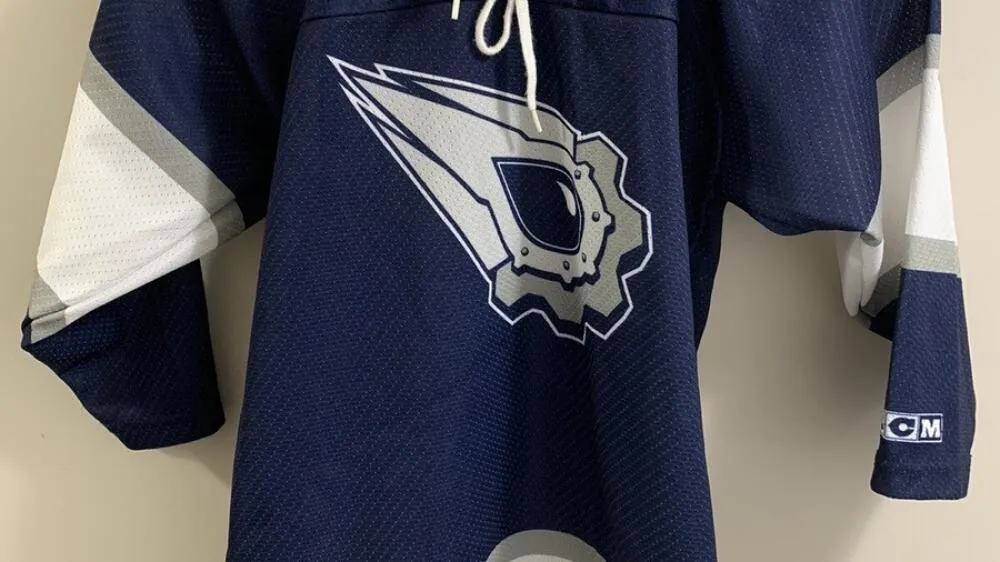
A defining element of theMcFarlane Edmonton Oilers third jersey was its symbolic detail. The primary mark featured blade-like shapes representing hockey skate blades and the fast-paced Oilers tradition, with five rivets around the oil drop representing the five Stanley Cup championships since 1979. Ten gear teeth (five outer, five inner) symbolized the team’s captains in NHL history. The gear imagery signified strength and teamwork, reinforcing a “well-oiled machine” metaphor tied to Edmonton’s oil heritage. The oil drop, derived from the original mark and turned on its side for speed, included a highlight to distinguish it. Promotional materials noted room to add rivets for future championships.
The secondary mark on the shoulders read “OILERS” in a bold, classic treatment inspired by retro logos, with a shield-like badge recalling Oil Kings roots (three crown peaks) and invoking authority. The bottom gear echoed the primary gear, with five rivets representing championships and a central oil drop.
How the Todd McFarlane Edmonton Oilers third jersey challenged franchise tradition
This jersey marked the Oilers’ most dramatic departure from tradition, moving away from reliance on the familiar blue-and-orange crest. It appealed beyond die-hard fans to pop culture followers and fashion-oriented hockey enthusiasts. The design remained in rotation until the 2007-08 season, when the league shifted to Reebok Edge jerseys, and the Oilers reduced their uniform sets. Over six seasons, players such as Ryan Smyth (#94) and Georges Laraque (#27) wore the McFarlane design during a rebuilding era. The jersey’s popularity among collectors has endured, and its legacy continues to influence discussions about sports branding and team identity.
The continuing debate over the Todd McFarlane Edmonton Oilers third jersey
Two decades after its introduction, opinions remain deeply divided, with fans praising the boldness or condemning the design as polarizing. The jersey experienced renewed attention through the NHL’s Reverse Retro program and remains a talking point in debates about tradition and innovation in branding. Collectors still seek authentic KOHO versions, and the outfit’s connection to contemporary stars like Connor McDavid and Leon Draisaitl is occasionally noted, though its return to regular use remains uncertain. The jersey’s place in Oilers history is secure as a symbol of taking creative risks and challenging the status quo.
Par Mike Jonderson
Mike Jonderson is a passionate hockey analyst and expert in advanced NHL statistics. A former college player and mathematics graduate, he combines his understanding of the game with technical expertise to develop innovative predictive models and contribute to the evolution of modern hockey analytics.